-
Key Takeaways
-
What Is a Surface Analysis Chart?
- How Long Is It Valid For?
-
How to Read a Surface Analysis Chart
-
Understanding Station Plots
- Sky Cover
- Pressure
- Pressure Trend
- Temperature and Dew Point
- Wind
- Weather Condition
-
Understanding Pressure Lines
- Highs and Lows
- Troughs and Ridges
-
Understanding Fronts and Boundaries
- Warm Fronts
- Cold Fronts
- Stationary Fronts
- Occluded Fronts
- Dry Line
- Squall Line
- Tropical Wave
- Frontogenesis (Initial Front Formation)
- Frontolysis (Front Dissipation)
-
Conclusion
Last Updated:
Should you fly today?
Check the weather!
But how do you view the big picture? It’s pretty tedious to manually look for weather reports for each station along your route.
Surface analysis charts!
Learning to read a surface analysis chart gives you a clear idea of what drives the weather around you.
Here’s how to interpret them.
Key Takeaways
- The surface analysis chart shows current weather conditions at the surface and low altitudes.
- It’s only valid for 3 hours.
- The chart uses symbols for station plots, pressure lines, and frontal boundaries.
- Station plots show local weather data like sky cover, pressure, temperature, wind, and significant weather.
- Pressure lines (isobars) indicate areas of equal pressure.
- Other features on the chart include highs and lows, troughs, ridges, dry lines, squall lines, and tropical waves.

Private Pilot
Study Sheet

Grab a printable PDF that highlights must-know PPL topics for the written test and checkride.
- Airspace at-a-glance.
- Key regs & V-speeds.
- Weather quick cues.
- Pattern and radio calls.
What Is a Surface Analysis Chart?
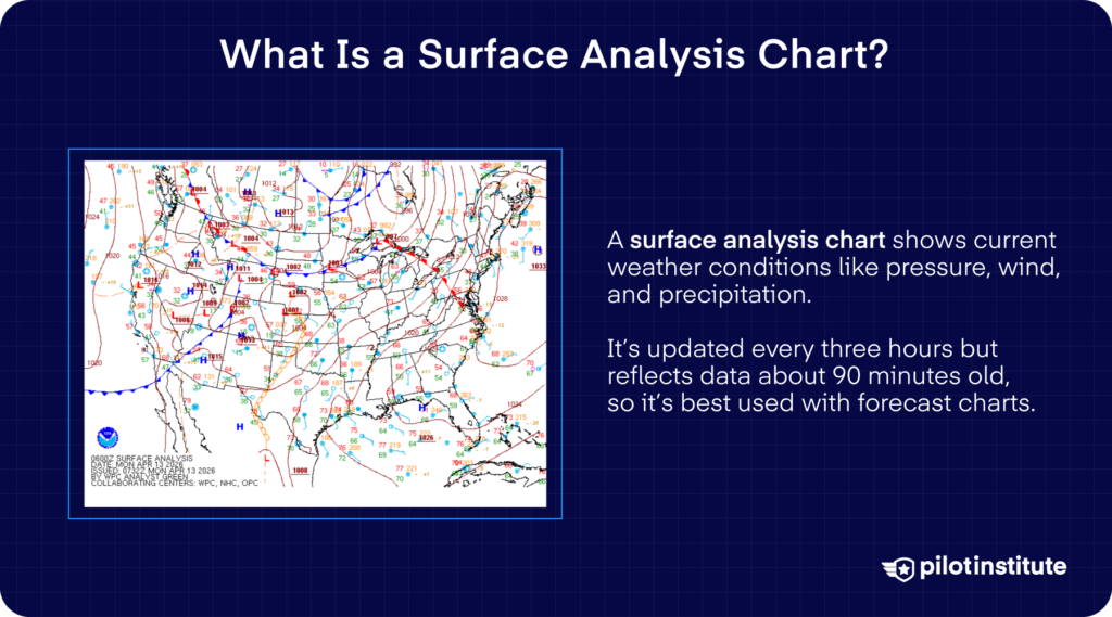
A surface analysis chart overlays weather conditions on a map. Pilots use it to get a visual understanding of phenomena like pressure, temperature, wind, and precipitation in the area at a given time.
The National Weather Service (NWS) generates surface analysis charts. The NWS operates the Weather Prediction Center, where you can find surface analysis charts, among others.
A surface analysis chart shows a snapshot of the weather at a specific time. It doesn’t give forecasts or predict how the weather will change. That’s the job of the Prognostic Chart, nicknamed the prog chart.
The distinction between current weather and forecasts is significant. Before you depart, you can check the surface analysis chart to help decide whether or not it’s safe to take off. You can also use it to understand the conditions you’ll encounter during your climb.
But depending on the flight length, the weather might be different by the time you land. That’s why a prog chart is more suitable than a surface analysis chart for en-route and destination weather. The surface analysis chart might show clear weather right now. However, prog charts could indicate deteriorating weather at your expected arrival time.
How Long Is It Valid For?
The NWS issues surface analysis charts every three hours. The chart gets less accurate the farther you get from that time.
Surface analysis charts aren’t published immediately after the NWS takes the weather snapshot. It takes around 90 minutes from snapshot creation to publication. When you see the chart, the data is about an hour and a half old.
So, remember that the chart represents the weather at the snapshot time, not the time of issuance.
How to Read a Surface Analysis Chart
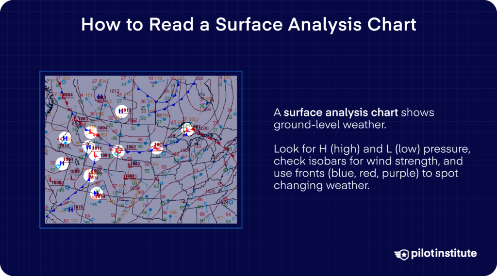
Surface analysis charts need to present a large amount of data very concisely. To make that possible, the chart uses symbols and codes.
Here’s an example of a surface analysis chart. It might seem overwhelming at first glance, so let’s break it down.
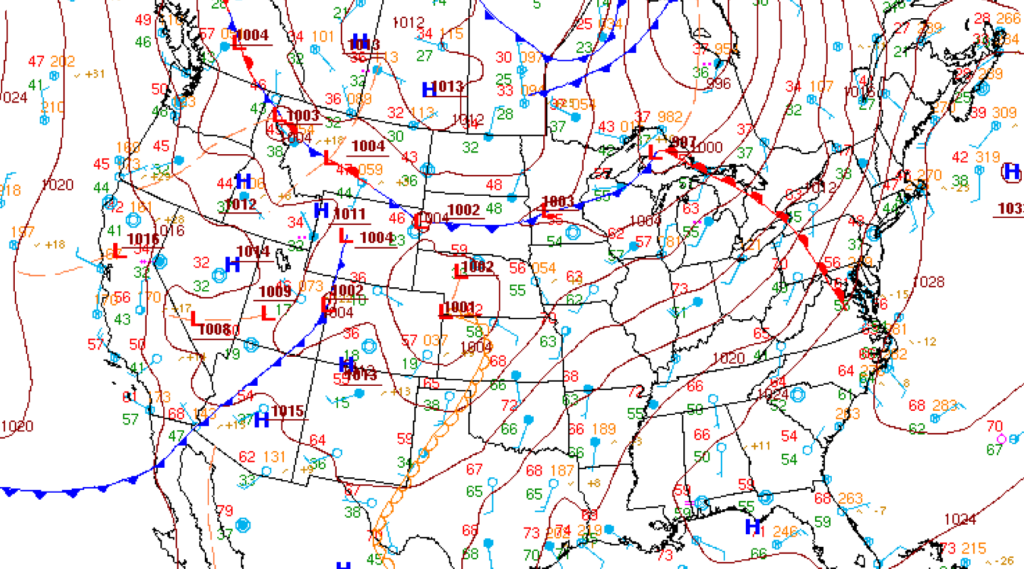
The first thing to look for is the date and time the chart is valid. You’ll find this in the text box at the bottom left along with the time of issuance.
In the above example, the chart is valid from 0900Z. The NWS issued the chart at 1028Z on January 21, 2024.
The NWS surface analysis chart shows three main components.
- Light blue dots surrounded by numbers that represent station plots.
- Curved maroon lines that represent isobars (lines of equal pressure).
- Lines with red, blue, or purple shapes that represent fronts.
Understanding Station Plots
Here is an example of an NWS station plot. It represents a weather station, usually located in or near a major airport.
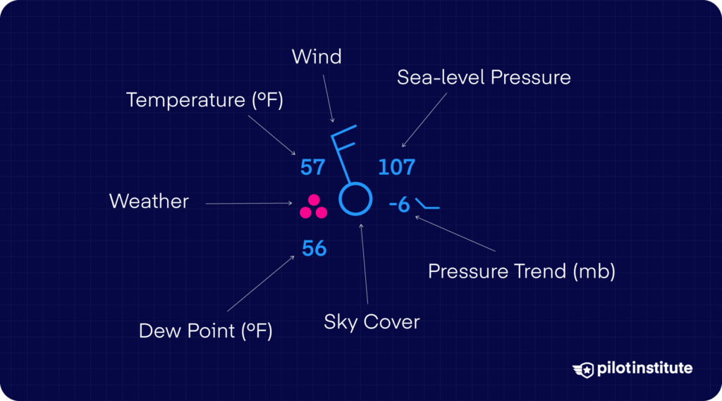
Each station plot gives you a complete picture of the weather conditions at its location. It includes information about:
- Sky cover.
- Atmospheric pressure and trend.
- Temperature and dew point.
- Wind.
- Any significant weather conditions.
It’s important to note that some weather sources use a different station plot layout. For example, the Aviation Weather Center (AWS) charts use a unique format for pilots.
Here is an example of an AWS station plot.
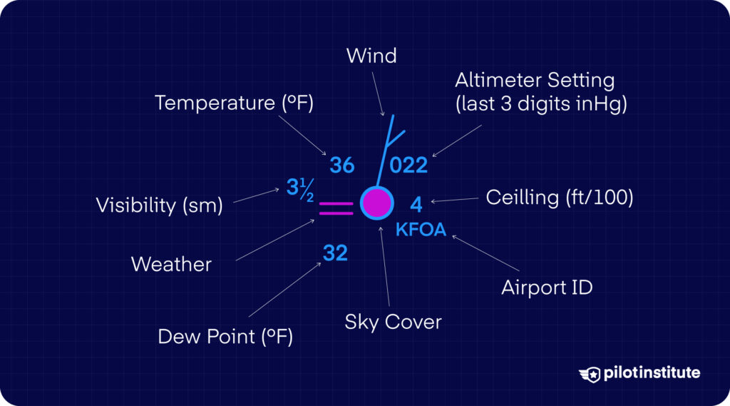
This plot layout doesn’t show the pressure trend. But it contains the following additions:
- Visibility (in statute miles).
- Altimeter setting (coded in inches of mercury).
- Cloud ceiling (hundreds of feet above ground level).
- Color-coded flight category.
- Airport ID.
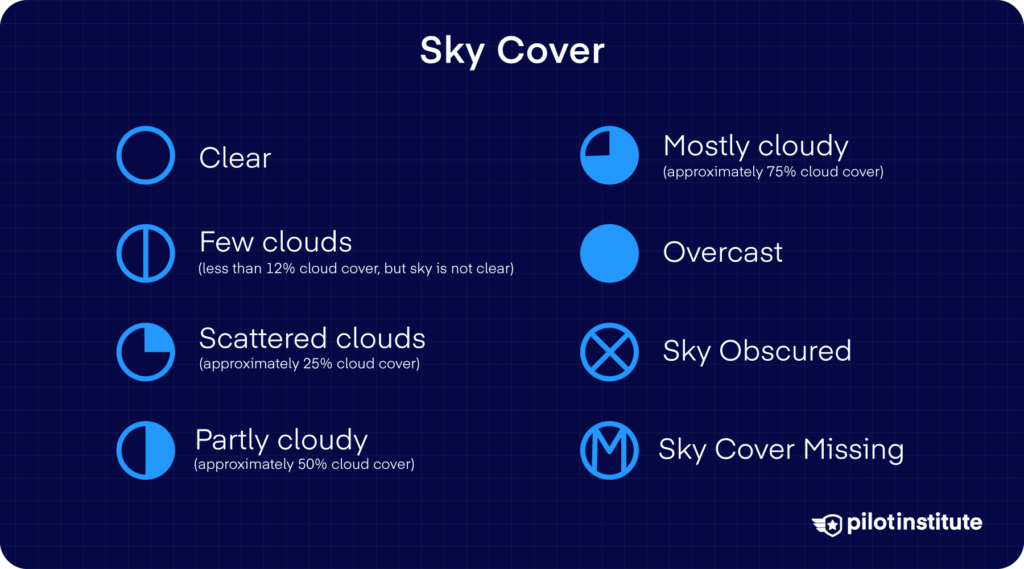
Sky Cover
The dot in the center shows the amount of cloud cover at the location. The unit of measurement used here is the Okta.
The Okta system divides the sky into a circle with eight parts. An all-white circle means the sky is clear. As more parts get shaded, the circle represents few, scattered, and broken clouds. A fully shaded circle means overcast conditions.
Pressure
At first glance, a pressure of 107 (NWS) or 022 (AWS) makes no sense.
NWS station plots show sea level pressure in three digits to the nearest tenth of a millibar (mb). For pressures greater than 1,000 mb, the number starts with 10. If the pressure is lower than that, it starts with 9.
So, in this case, a pressure of 107 means 1010.7 mb. If the pressure reading were 998.2 mb, the station plot would show it as 982.
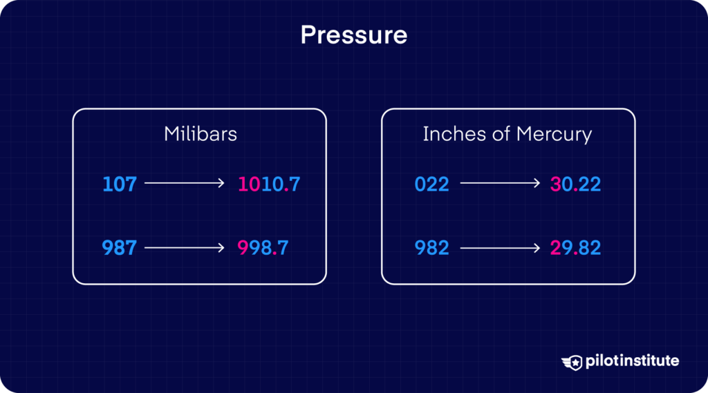
AWS plots show the altimeter setting in hundredths of an inch of mercury. The plot omits the leading number.
For altimeter settings of 30 inches of mercury or more, the number starts with a 0. You’ll need to add a 3 to the start, then place the decimal point in the middle.
If the altimeter setting is under 30 inches of mercury, the number will start with a 9. Add 2 to the start in this case.
To explain this simply:
000 to 049 → Prefix with 30 (008 → 30.08 inHg).
950 to 999 → Prefix with 29 (982 → 29.82 inHg).
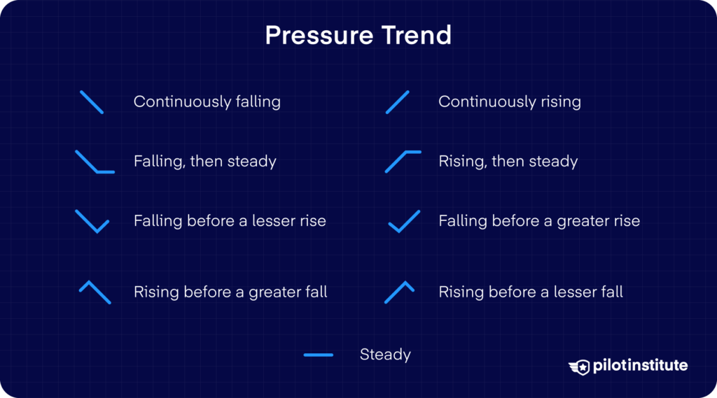
Pressure Trend
Atmospheric pressure can change very quickly compared to other weather parameters. The surface analysis chart is just a snapshot, so an instantaneous pressure reading doesn’t tell the whole story. That’s why station plots also include the change, or trend, in atmospheric pressure.
The pressure trend shows how many tenths of millibars the pressure increased or decreased in the past three hours. The number -6 in the example above means the pressure dropped by 0.6 mb. The symbol next to it shows the change graphically.
Temperature and Dew Point
The number on the top left shows the surface air temperature in Fahrenheit.
The number on the bottom left represents the dew point.
What is the dew point?
The dew point is the temperature at which water vapor in air starts to condense. Air temperatures close to the dew point indicate high humidity. You’ll start to see fog or clouds and might be at risk for icing. Rain or snow is also possible. In warm weather, high humidity can signal thunderstorms building up.
Since the station plot also shows the dew point temperature in Fahrenheit, comparing it with the air temperature is easy.
Wind
Wind is represented by the barb coming out of the center circle. The direction of the barb shows where the wind is coming from. The marks at the outer end let you know the wind speed.
A short line means 5 knots.
A long line means 10 knots.
A flag means 50 knots.
Add up all the marks on the barb to get the wind speed.
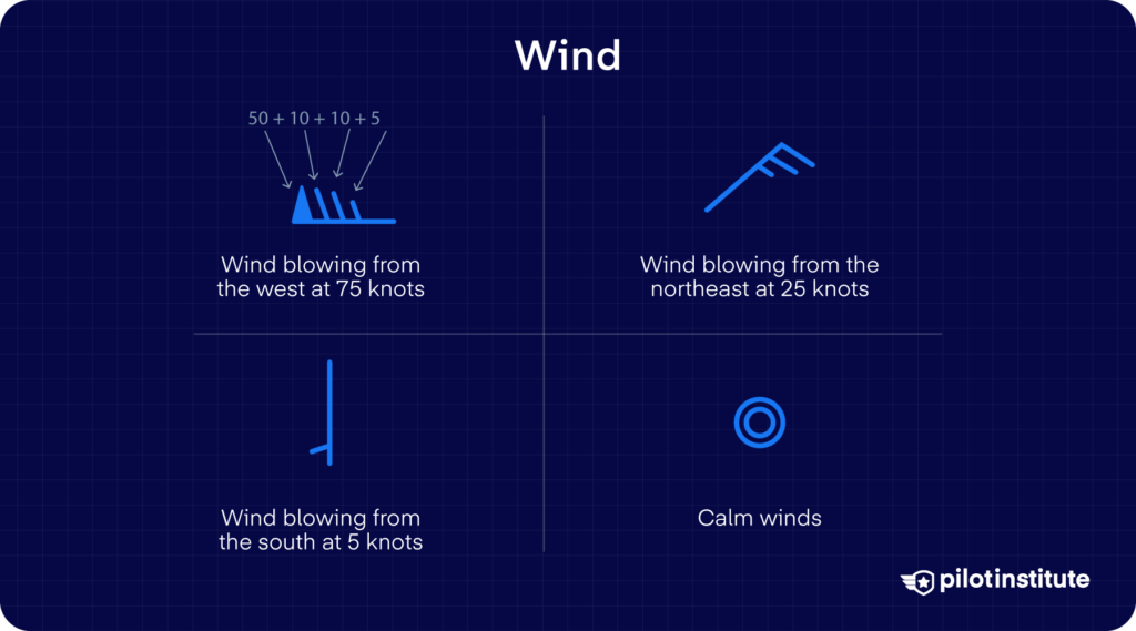
If there’s no barb on the circle, it means the winds are calm.
Weather Condition
Finally, the symbol to the left of the circle indicates the current weather conditions.
The symbol only shows up if there’s a condition affecting visibility or causing precipitation. Here’s a list of some common weather symbols you’ll encounter on surface analysis charts.

The complete list of symbols is available on aviationweather.gov.
Understanding Pressure Lines
The wavy lines on this surface analysis chart are isobars. Isobars are lines of equal pressure. So, areas under a single isobar have the same atmospheric pressure conditions.
Isobars include a label with their pressure measurement in the same color. The labels are often underlined to increase their visibility among the clutter on the chart. Note that, unlike station plots, isobars directly show the pressure in millibars.
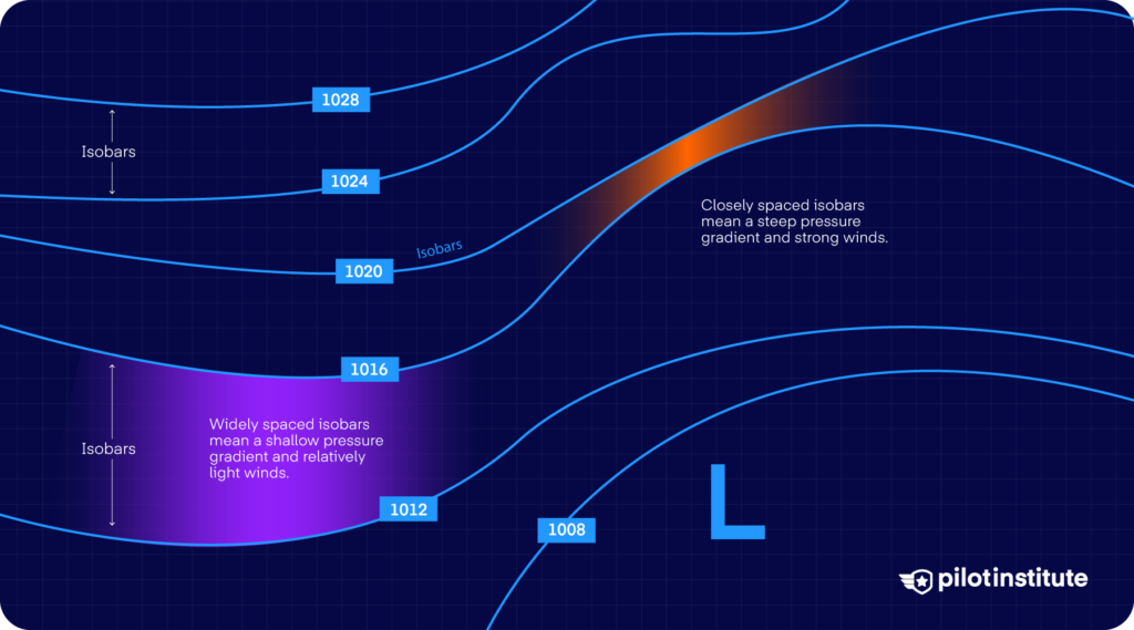
Generally, isobars are spaced every four millibars. However, areas with a weak pressure gradient can show intermediate isobars after every 1 or 2 millibars.
Isobars also inform you about the winds you can expect at heights between 2,000 and 3,000 feet. At these heights, expect the wind to flow parallel to the isobars. Below 2,000 feet, the wind gets impeded by surface obstacles and slowed down by friction with the surface.
Highs and Lows
If you see an isobar loop around and form a circle or oval, it’s called a closed isobar. Closed isobars surround areas where the pressure is either the highest or the lowest in the region.
High-pressure systems are also called anticyclones or just highs. Low-pressure systems are called cyclones or lows. The surface analysis chart shows highs with a large blue H and lows with a large red L.
Lows are typically associated with stormy weather. The air in a low-pressure system cools and rises rapidly, forming clouds and precipitation. Pilots are also wary of low atmospheric pressure as it directly relates to reduced air density, which reduces engine power.
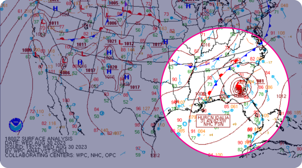
The lower the pressure, the more dangerous the pressure system. Extremely low-pressure systems turn into cyclones and hurricanes. This surface analysis chart shows Hurricane Idalia making landfall in Florida in 2023. You can see the closed isobars circling it and a low of 981 millibars. The symbol in the middle represents a hurricane.
On the other hand, highs exhibit fair and dry weather. Air sinks and dries in anticyclones, preventing cloud formation and creating gentle winds.
You can read more about high and low pressure systems.
Troughs and Ridges
In some cases, the isobars have elongated shapes that are not closed. If these shapes represent low pressure, they’re called troughs. Their high-pressure equivalents are ridges.
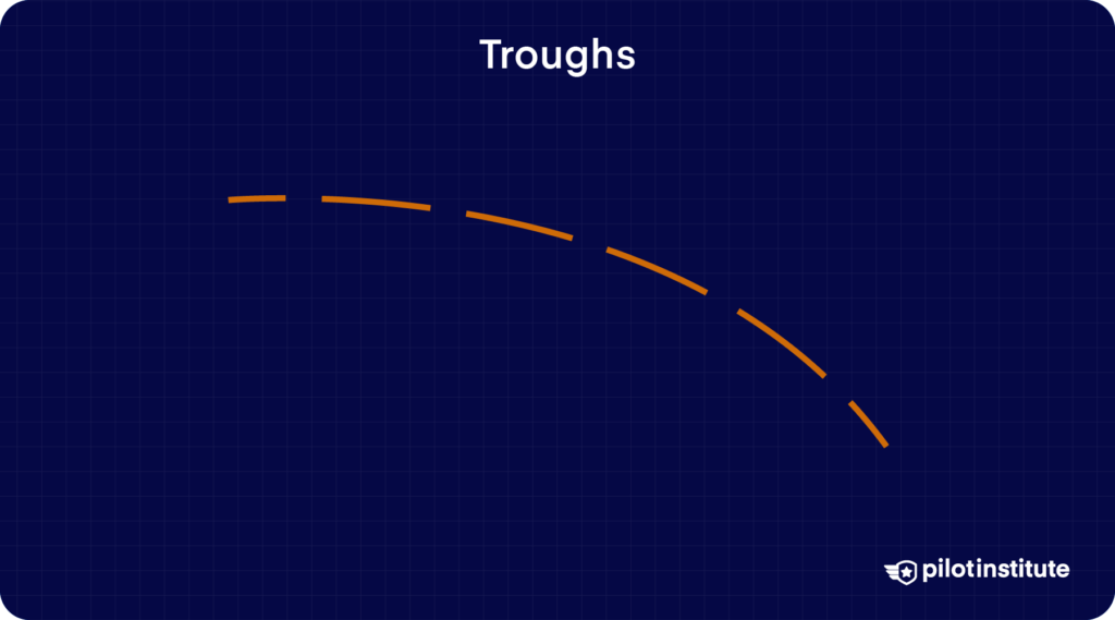
Surface analysis charts show troughs as brown or yellow dashed lines. Troughs feature typical low-pressure weather, including gusty winds, clouds, and precipitation.
Most surface analysis charts don’t show ridges. Charts that do display ridges depict them as yellow or brown zig-zag lines. Ridges have typical high-pressure weather with clear skies and light winds.
Understanding Fronts and Boundaries
Fronts are boundaries between two types of air masses.
What is an air mass?
Air masses are vast bodies of air that have generally uniform weather conditions. They form when air lies stagnant over an area such as a tropical ocean, a desert, or a polar region.
The stagnant air takes on the temperature and moisture properties of its surroundings. The newly formed air mass then gets pushed around by weather systems. Eventually, two or more air masses collide, which brings us back to fronts.
The type of front we see on the chart depends on which air masses collide. The arrival of any front always means the weather is about to change.
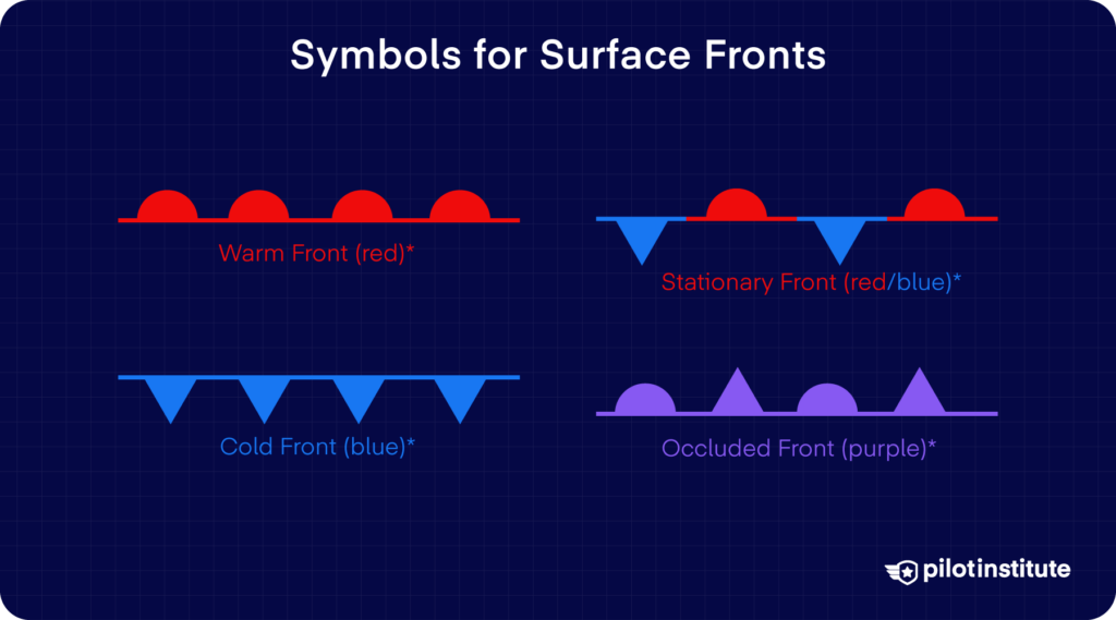
The types of fronts are:
- Warm
- Cold
- Stationary
- Occluded
Warm Fronts
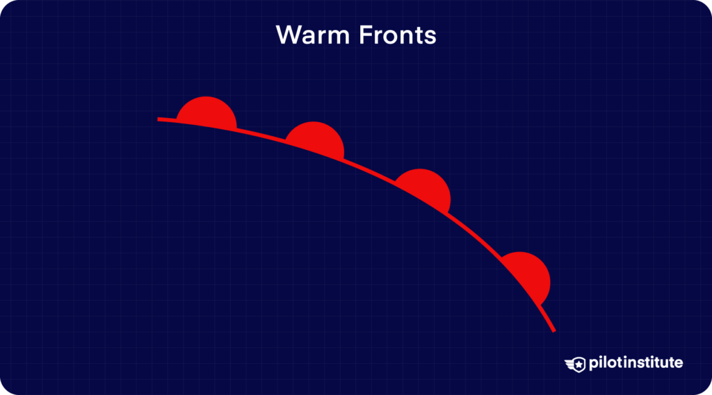
Warm fronts happen when a warm air mass moves to replace a cooler air mass. They’re associated with gradual weather changes, including light rain, drizzle, and a temperature rise.
Warm fronts move slowly and can stay in an area for days. Since the warm air is lighter, it slides over the top of the cold air mass and gradually pushes it away.
Surface analysis charts represent warm fronts as a red line with semicircles pointing toward the warm air movement.
Cold Fronts
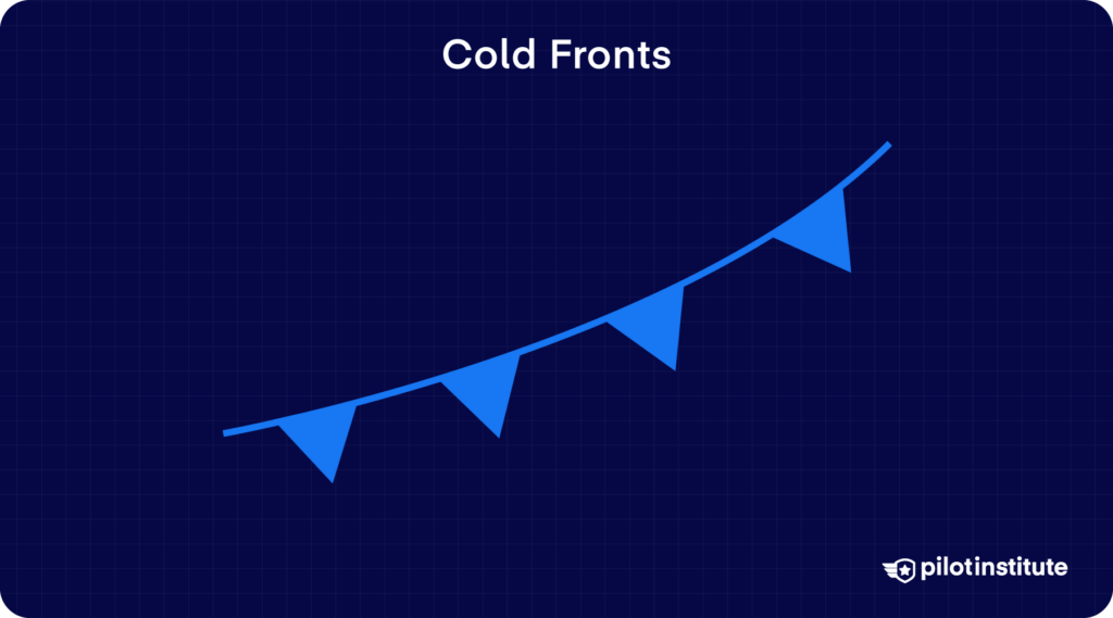
We get cold fronts when a cold, dense air mass advances and replaces a warm air mass. Cold fronts result in abrupt weather changes, such as thunderstorms, heavy rainfall, and temperature drops.
Cold fronts can travel at twice the speed of warm fronts. They form rapidly and generally cause violent weather activity along the frontal boundary. The cold air stays close to the ground and lifts the warmer air mass ahead of it.
On surface analysis charts, cold fronts are blue lines with triangular spikes pointing in the direction of their movement.
Stationary Fronts
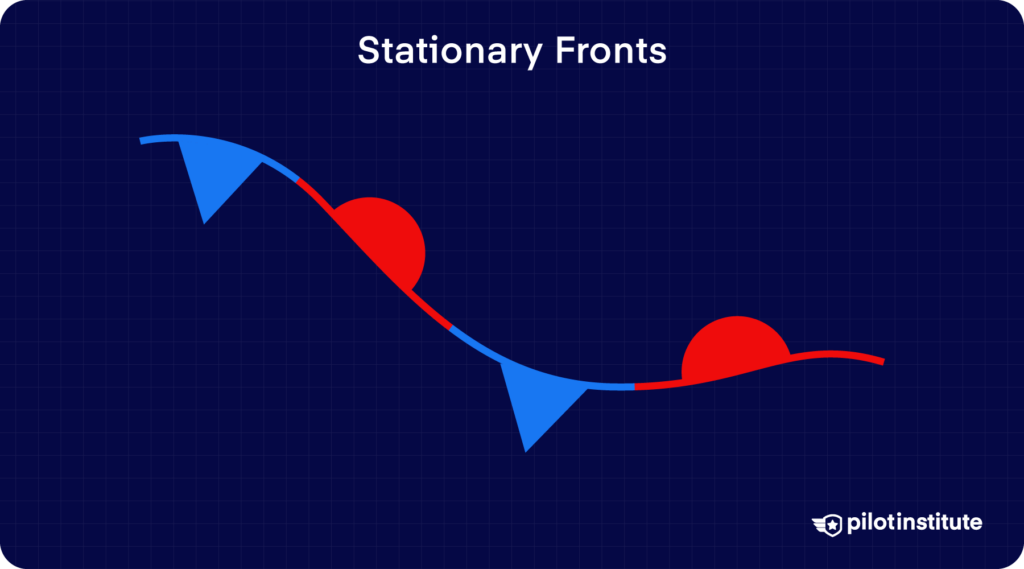
Stationary fronts exist where the forces pushing each air mass cancel each other out. Neither air mass can displace the other. The front remains suspended in one place for up to several days.
There’s a sharp temperature contrast between the adjacent air masses, causing prolonged bad weather and rain.
Stationary fronts feature alternating blue spikes and red semicircles in opposite directions.
Occluded Fronts
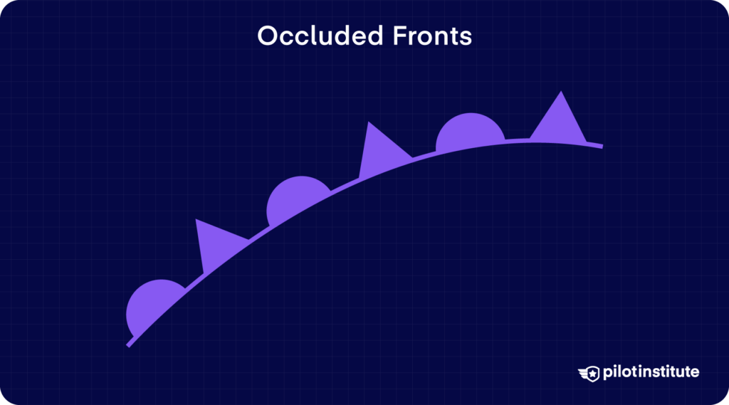
An occluded front forms when a cold front and a warm front travel in the same direction. The cold front, being faster, catches up to the warm front and overtakes it. This leads to the warm air mass lifting off the ground.
If the cold front is colder than the air ahead of the warm front, the cold front slides downwards and lifts the warm front aloft. This is called a cold front occlusion and is the most common type of occluded front. Cold occlusions generally cause heavy rainfall.
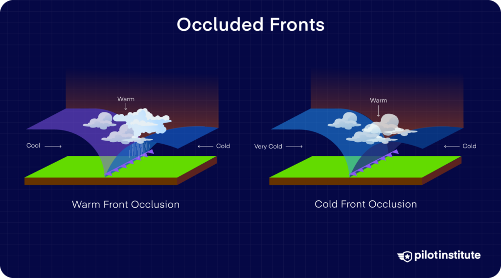
Alternatively, if the cold front is not colder than the air ahead of the warm front, we end up with a warm front occlusion. In this case, the cold front slides between the warm front and the cold air ahead. Warm occlusions show a more gradual weather change but lead to prolonged periods of rain.
Both types of occlusions appear as a purple line with alternating spikes and semicircles in the same direction.
Dry Line
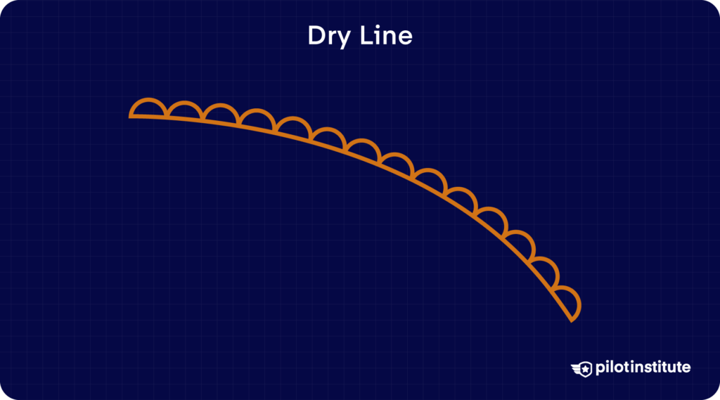
A dry line is a boundary separating a moist and a dry air mass. It’s most common in spring and early summer and lies north-south in the central US states.
The moist air mass is usually on the east side, bringing moist air from the Gulf of Mexico. The dry desert air comes from the west side.
Dry lines appear as brown lines with scallops facing the moist air mass. Pilots try to avoid them, as they can trigger severe weather.
Squall Line
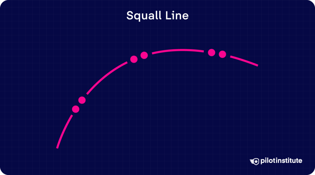
Squall lines represent a continuous line of thunderstorms. They usually occur near severe pressure fluctuations, often just ahead of cold fronts. Squall lines can travel at a speed of 25 to 50 miles per hour or more.
They’re drawn as a pattern of two red dots and two dashes.
Tropical Wave
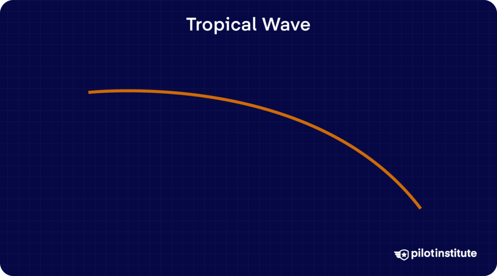
Trade wind easterlies are surface winds near the equator that blow east to west. Tropical waves are troughs within these winds that can develop thunderstorms and even tropical cyclones.
Given their unstable nature, pilots keep well away from them.
On the surface analysis chart, they’re shown with a curved orange line with the label ‘TRPCL WAVE.’
Frontogenesis (Initial Front Formation)
As fronts generally bring bad weather, pilots need to know whether the front is in its initial formation stage or is weakening and is about to dissipate.
Frontogenesis is the initial formation of a frontal zone. Surface analysis charts show it by breaking up the front line into dashes. Every single segment has the symbols of spikes or semi-circles representing the type of front.
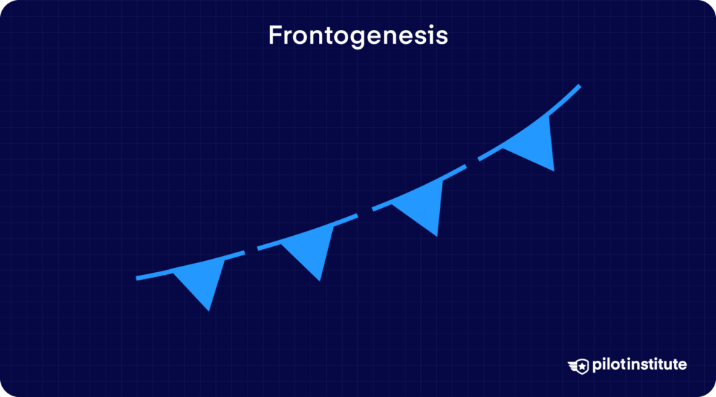
If a chart shows frontogenesis, pilots can expect that front to grow stronger with rapid and significant weather changes. They might need to adjust their route around the front or consider diversions to alternate airports.
Frontolysis (Front Dissipation)
Frontolysis is the dissipation of a frontal zone. This stage is also represented with a dashed line, but the frontal type symbol is only drawn on every other segment.
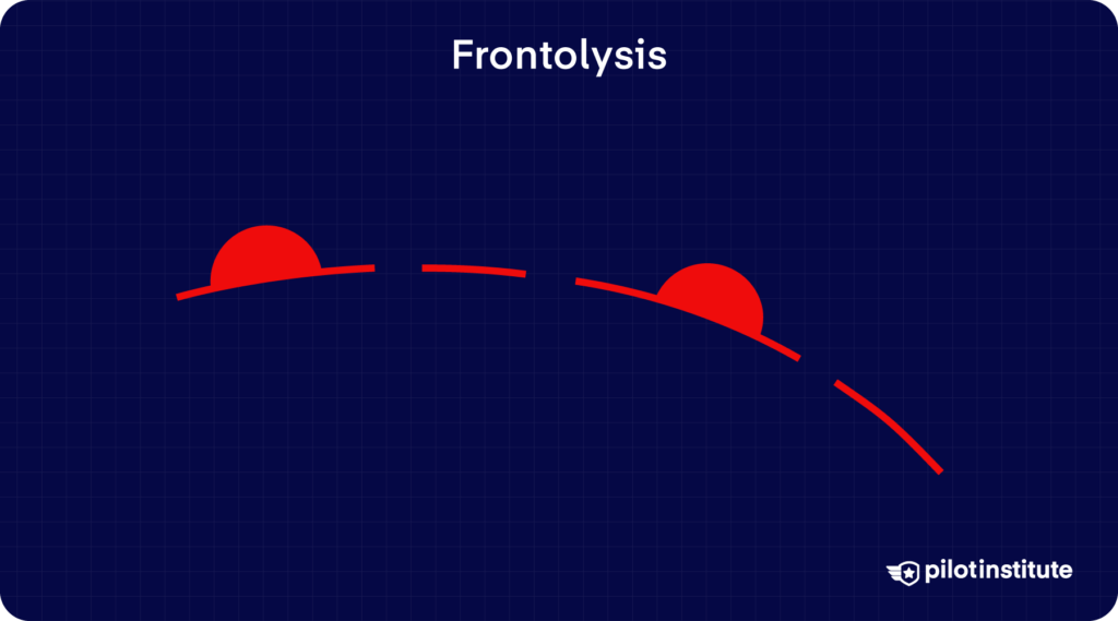
Frontolysis on a surface analysis chart indicates that the front could dissipate soon. Expect the adverse weather to clear up and stable atmospheric conditions to follow.
Conclusion
Understanding the weather is always complex. Pilots try to use as many sources of weather information as possible to improve their safety in the air.
After using the surface analysis chart for initial flight planning, the next step involves reading METARs and TAFs. Learn how to read them here.