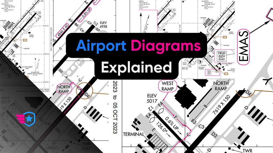
How does a pilot know where and how to get to the runway or parking at an airport?
Pilots use airport diagrams to navigate the taxiways and runways to get to the required area, even if it’s the first time the pilot has been there!
But how do you use the airport diagram, and what information does it contain?
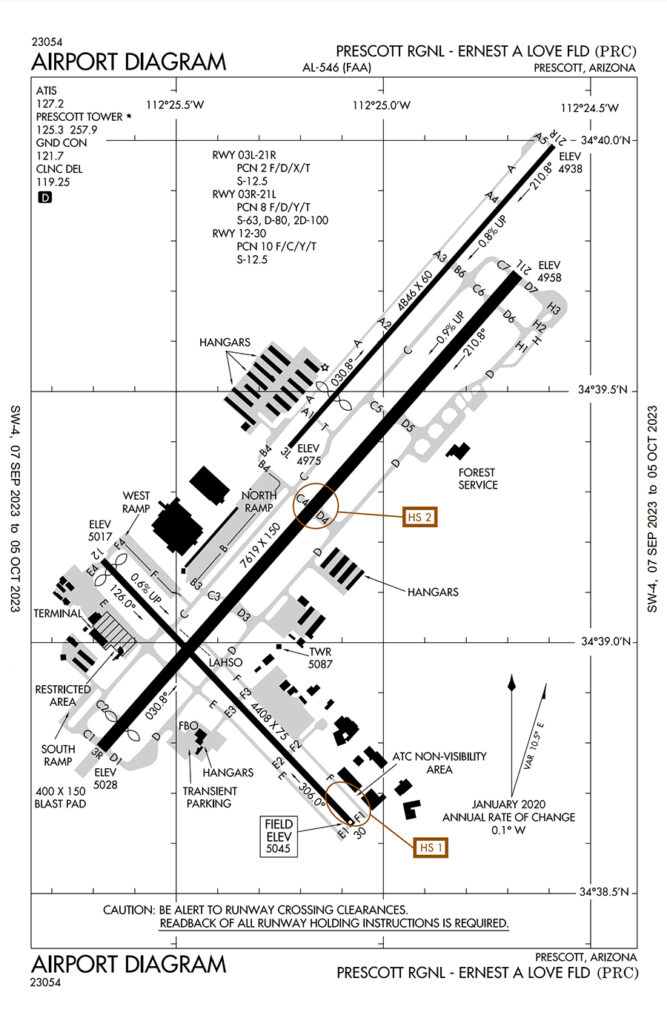
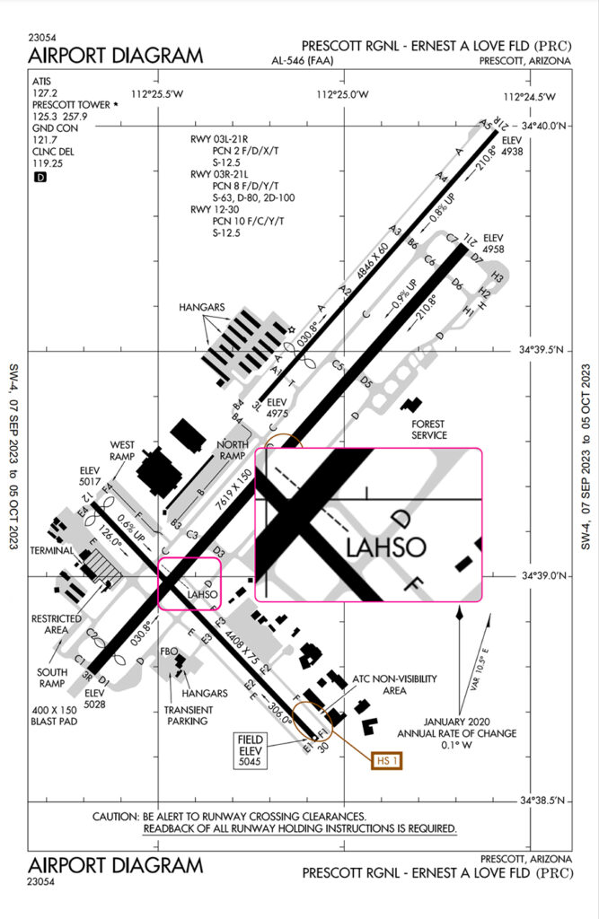
Let’s go through an airport diagram to understand the elements and application of the information. For this lesson, let’s use Prescott Regional Airport as an example.
Elements of an Airport Diagram
- Margin Data
- Frequency List
- Taxiways
- Runways
- Miscellaneous Information
- Hot Spots
Margin Data
Airport Diagrams are published by the Federal Aviation Administration (FAA) and follow a common format across the publications they provide.
The margin, which is the area around the airport diagram, contains important information that provides relevance and accuracy.
The top and bottom of the diagram contain the date of the latest revision, the type of chart, the name of the airport, and its identifier.
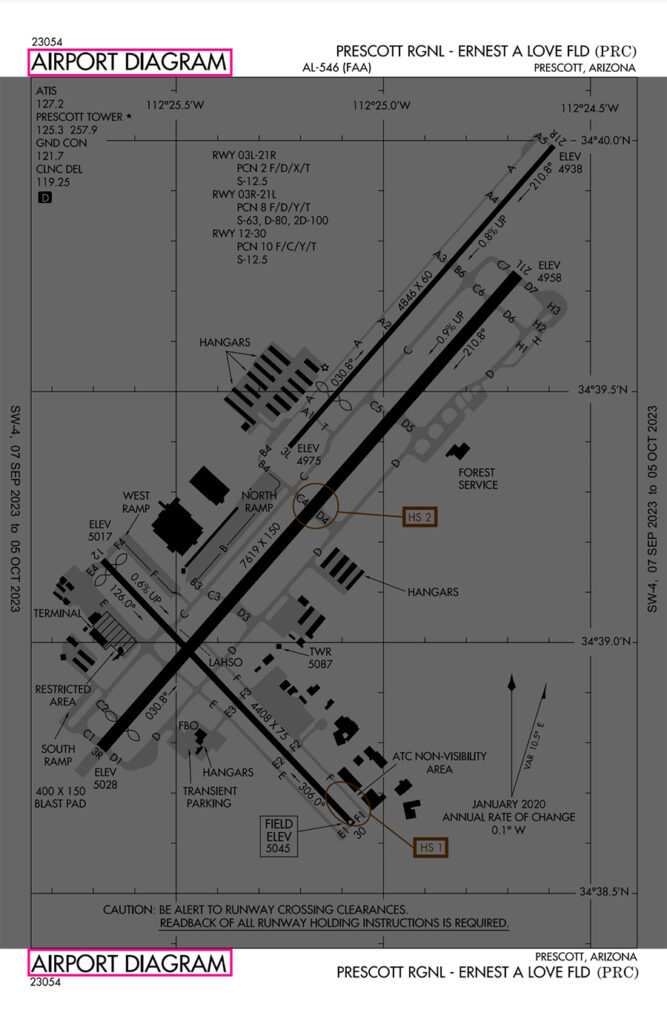
Date of Latest Revision
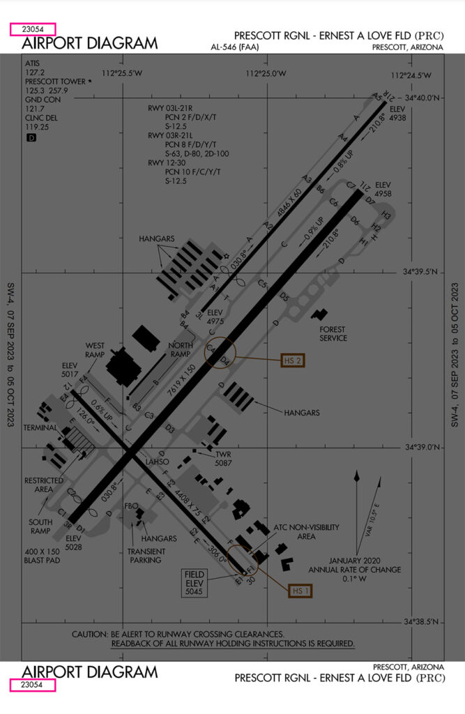
The date of the latest revision represents the day of the last amendment to the chart. It uses the Julian date format, with the first two digits indicating the year, and the last three digits indicating the day of the year.
For this chart, 23054 represents the 54th day of the year 2023.
Type of Chart
The enlarged text “airport diagram” helps the pilot identify what this chart contains. When the pilot is managing several reference charts, it is helpful to have the title labeled.
Airport Name and Identifier
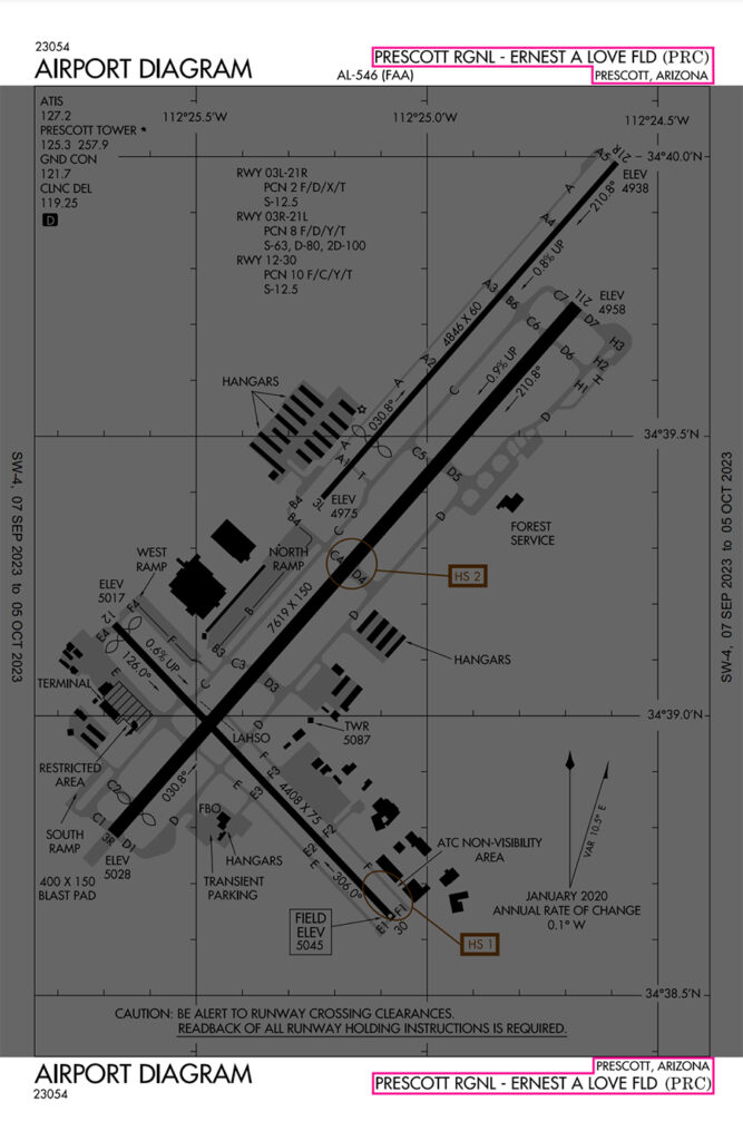
The right corner of the chart contains the name of the airport, Prescott Regional – Ernest A Love Field, and its International Civil Aviation Organization (ICAO) identifier, PRC.
All this information helps ensure the pilot is looking at the right airport diagram.
Effective Date
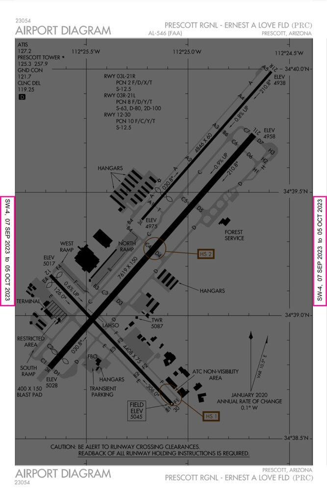
On the left and right sides of the airport diagram, there is an effective date. This is when the airport diagram is current.
This date range of 7 September 2023 to 5 October 2023 represents when this chart is accurate.
Beyond 5 October 2023, the airport diagram is considered expired and should not be used.
Aeronautical information changes frequently, so it is important to always use current editions and discard expired charts.
Frequency List
On the top left of all airport diagrams, there is a list of frequencies relevant to the airport.
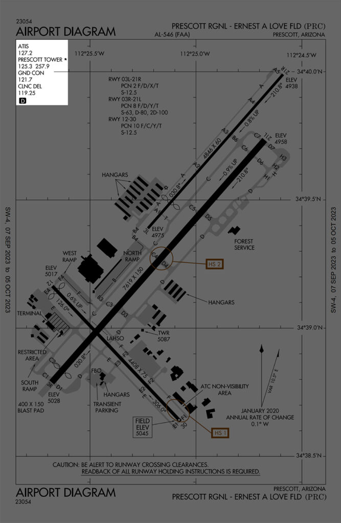
This list of frequencies includes everything that relates to the airport. This provides a good reference for the pilot to use if they are unfamiliar with the airport.
The black square with a D symbol indicates that runway distance information is available. The pilot can consult the chart supplement for more details on available runway distances.
Taxiways
The areas in gray are movement areas on the airport. You can expect aircraft to move around in these areas as they get from their parking spot to the runway, and vice versa.
These movement areas are called taxiways and are labeled with a combination of letters and numbers.
Runways
The long, black lines are the runways at the airport. At Prescott Regional, there are three runways.
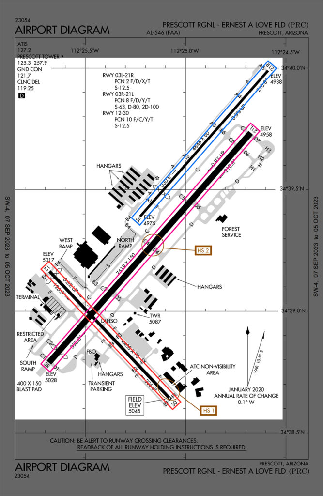
Knowing the available runways helps the pilot expect several steps. Let’s go through two examples of how this information helps.
Let’s assume the winds are coming from the north.
For the pilot who is starting their trip from the West Ramp, they can expect to use runway 3R. To get to the runway, they can expect the ground controller to route them by taxiways F, C, cross runway 12, C1, to runway 3R.
For the pilot who is arriving at Prescott Regional and will park at the North Ramp, they can expect to use runway 3R. The pilot can expect to make a left turn off the active runway onto C4, cross C, and enter the North Ramp.
By using the airport diagram, the pilot can expect what runway to use and the route to take when navigating the airport.
An added benefit is that the pilot won’t be in a rush to listen, understand, and remember the routing to read back to the controller. This allows the pilot to be less task saturated, and have better situational awareness for a safer operation.
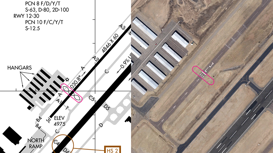
Some important information can be found around the runways on the airport diagram. Let’s use Runway 3L/21R as an example.
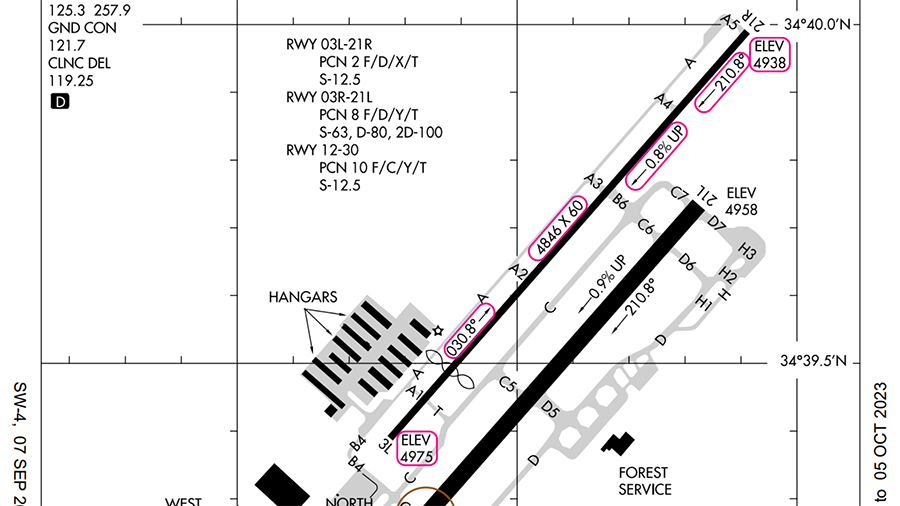
According to the diagram, the runway has a length of 4846 feet and a width of 60 feet. If landing on Runway 21R, there is an upslope to the runway of 0.8%, and a downslope if using the reciprocal.
The exact magnetic heading of the runway is 30.8° for 3L and 210.8° for 21R.
Additionally, the elevation of each threshold is depicted at the end of each runway.
The black-lined ovals around the south end of the runway represent a displaced threshold. Aircraft are allowed to use that length of runway to take off, but not to land.
This reduces the landing distance available, and pilots should be wary of performance figures to ensure adequate takeoff and landing distances as part of their planning.
On the PRC airport diagram, you’d notice the word LAHSO, with a line across the runway. LAHSO is an acronym for land and hold short operations.
Air Traffic Controllers (ATC) may ask the pilot that they land and not pass the line, and the pilot can choose to accept or decline an LAHSO clearance from ATC.
While uncommon, an Engineered Material Arresting System (EMAS) has been installed in 71 airports as of 2023. This system can slow or stop an aircraft that overruns the runway.
EMAS is depicted as white rectangles with black borders at the end of the runway and is labeled EMAS.
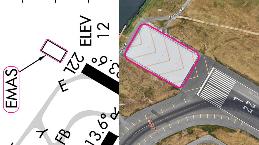
EMAS at JFK airport
To learn more about common runway markings that aren’t found in the airport diagram, check out our Essential Guide to Runway Markings.
Miscellaneous Information
Airport Beacon
The airport beacon is represented by a star on the airport diagram. The location of the beacon relative to the airport is important, especially when it comes to flying at night or in poor weather conditions.
The pilot would be able to locate the airport from the air and use the airport diagram to approximate where the runway is relative to the beacon.
Tower
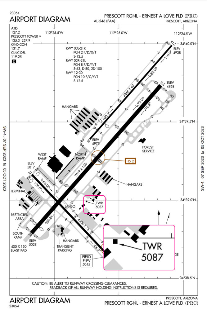
The airport’s Air Traffic Control Tower is labeled TWR. It is important to know where the tower is located on the field, as pilots without an operating radio have to look out for light gun signals from the control tower.
The number below the TWR represents the height of the control tower, which aids in obstacle avoidance.
If the airport beacon is located on the tower, the airport beacon symbol will be used and labeled TWR.
Field Elevation
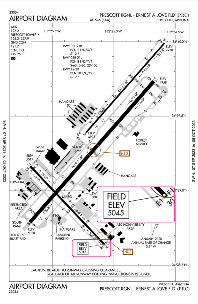
The field elevation, a box with the words FIELD ELEV, followed by a number, is the elevation of the airport from mean sea level in feet. Knowing the elevation of the airport helps ensure the altimeter of the aircraft is accurate.
Magnetic Variation and Change
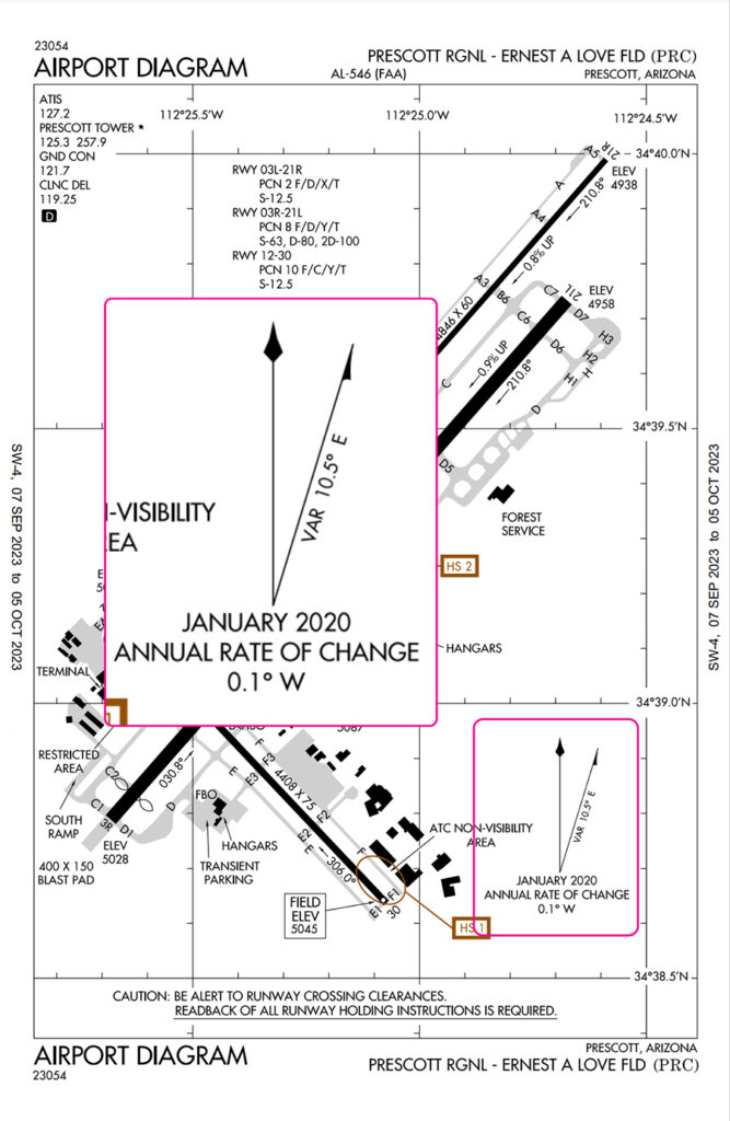
For runway 3R, the magnetic heading is approximately 030°, so the compass should show close to 030° when aligned with the runway.
Just a friendly reminder that the yearly change in magnetic direction is 0.1° W to the west. This means that over time, the runway numbers may need to be changed if the magnetic heading changes too much.
Latitude and Longitude
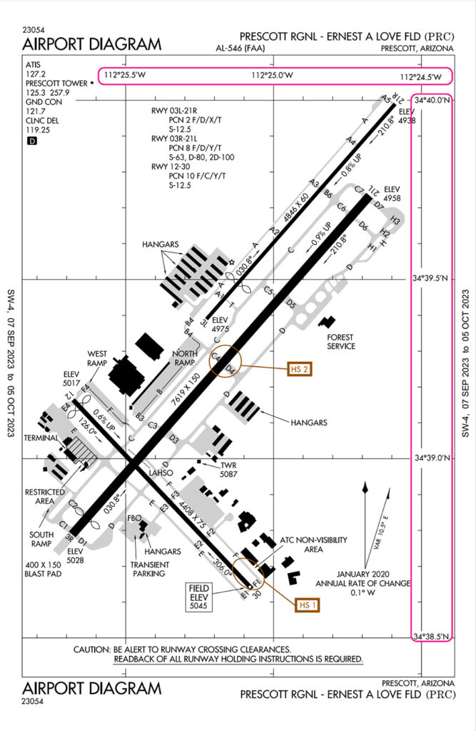
Within the airport diagram, there are grid lines with the latitudes and longitudes. These help ensure the GPS on board is providing an accurate location.
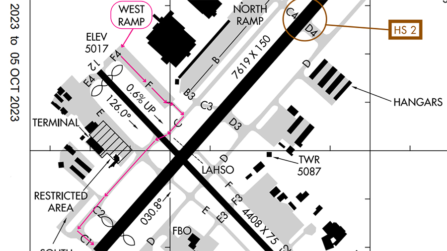
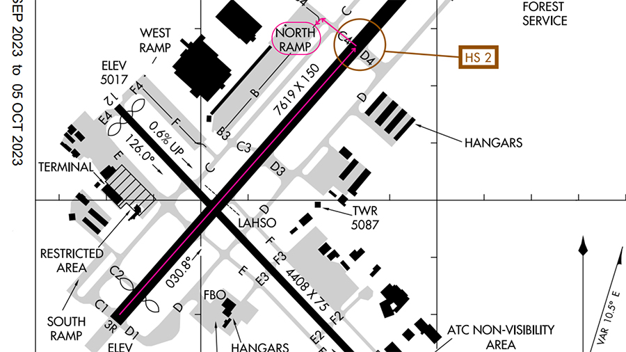
Hot Spots
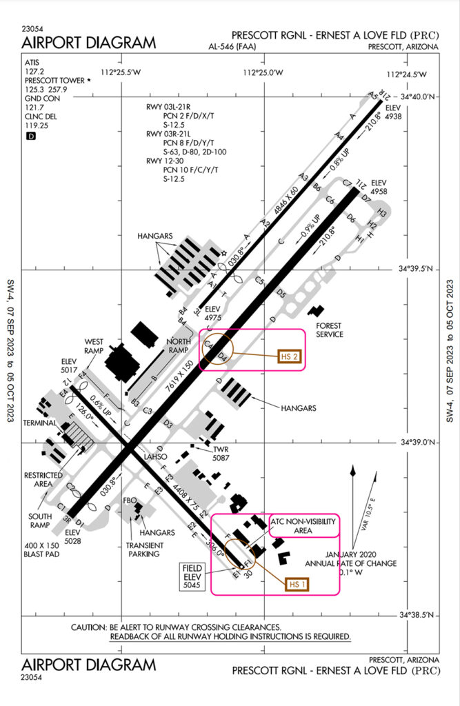
A hot spot is a location in the airport that is at higher risk, and extra vigilance by the pilot is needed. This is based on historical data or the potential for collisions or runway incursions.
At Prescott Regional, there are two hotspots, one on Runway 12/30, and the other on Runway 3R/21L. They are marked with the brown circles and labeled HS 1 and HS 2.
We can find more information on the hot spots in the Chart Supplement.
For Prescott Regional, the Chart Supplement says that the run-up area at taxiway F1 is not visible from the tower. Since the ground controller cannot see that area, the pilot needs to exercise extra vigilance for unexpected aircraft or vehicles in the area.
For HS 2, there are frequent runway crossings made in that area.
Conclusion
While we covered most of the important elements of an airport diagram, your local airport may have more symbols!
Consult your instructor or the Aeronautical Chart Users’ Guide for more details.
FAA published Airport Diagrams can be found on FAA, Airnav, and AOPA websites.
If unfamiliar or lost, don’t hesitate to let the Air Traffic Controllers know, and they will also be able to provide progressive taxi instructions.
Instead of giving the whole taxi route clearance, they would watch your aircraft and inform you as and when you reach intersections as to which way to turn.